.

Painting Number 2: Franz Kline, 1954 (Museum of Modern Art, New York)
Rothko’s hovering tiers of atmospheric color attack Keokuk, Iowa.
Johns’s tonic simplicity of stripes and circles is in some ways a cop-out.
De Kooning, Pollock and Kline’s athletic calligraphy derives from surfing.
Stella’s monastic designs appeal to lemurs.
Mondrian’s black bars on white grounds rise and shine.
Newman’s variations on an ostensibly straight line are in fact crooked.
Ad Reinhardt’s black paintings were left out in the rain overnight.
Manet’s qualities of absence cause skin disease.
Andy Warhol’s rows of ten-by-twenty cans don’t contain Campbell’s soup.
Kenneth Noland’s target, chevron and stripe paintings mime the noodling movements of antique biplanes.
Donald Judd and Robert Morris’s stubbornly indivisible equal-unit designs suck.
Johns’s sculpmetal embalmments of a light bulb and a flash light emit a glow of total friendliness.
Monet’s chromatic and luminary variations on such themes as a haystack look OK.
Frank Stella’s pictures of “nothing” are just that.
Roy Lichtenstein’s Pop paintings bubble upwards.
Le Corbusier’s 1939 plan for an infinitely expandable museum went down the toilet.
Malevich and Mondrian’s conceptual idealism threw us off the track.
Judd and Morris’s antagonism to marks of personal handicraft is like God’s.
Mondrian and Newman’s Eureka quality of beauty fails completely.
Stella’s art turns me on.
Jasper’s Dilemma is the state motto of Utah.
Mondrian’s tough irreducible nut of radiant energy indicates drug abuse.
Stella’s enclosed field of multiple unfocused activities shows that he is a secret jackoff artist.
Kenneth Noland’s chevron paintings of 1963-64 were commissioned by an insect.
Jasper Johns’s “0-9” lithographs of 1963 tell us to make love not war.
Miriam Schapiro, Larry Zox, Ron Davis and Darby Bannard’s investigation of fictive depth on a plane surface would be possible only under capitalism.
Pollock and Kline’s participation in a field of forces is old hat.
Morris Louis and Kenneth Noland’s searing antibodies of color make whoopee.
Robert and Sonia Delaunay’s rainbow disks smack of homework.
Newman’s thin bands on open fields of color decorate Uranus.
Roy Lichtenstein’s parodies of the aggressively “moderne” fooled the police.
Darby Bannard’s curious pastel blandness relates to a hatred of arithmetic.
De Kooning’s impact is not to be spoken of here.

Woman V: Willem De Kooning, 1952-1953 (National Gallery of Australia, Canberra)

Onement I: Barnett Newman, 1948 (Museum of Modern Art, New York)
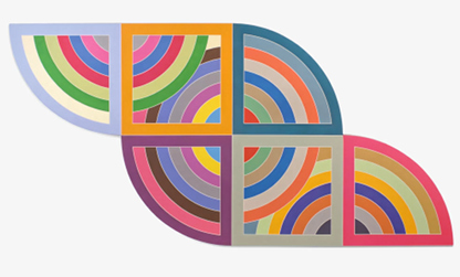
Harran II: Frank Stella, 1967 (Guggenheim Museum, New York)

No. 5: Jackson Pollock, 1948 (private collection)


Composition No. 10: Piet Mondrian, 1939-1942

Campbell's Soup Cans: Andy Warhol, 1962 (Museum of Modern Art, New York)

Bridge: Kenneth Noland, 1964
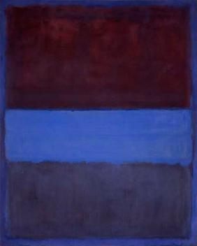
No. 61 (Rust and Blue): Mark Rothko, 1953 (Museum of Contemporary Art, Los Angeles)
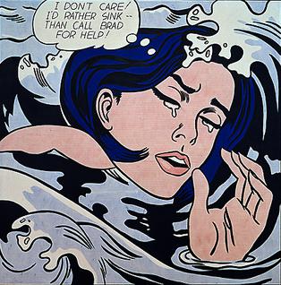
Drowning Girl: Roy Lichtenstein, 1963

Black Square: Kazimir Malevich, 1913 (State Russian Museum, St. Petersburg)
33 Statements: from Neil Young, 1971


14 comments:
Thanks. Just what I needed today. Curtis
It's nice (I would just like to say) to see Ron Davis and Larry Zox included.
"Robert and Sonia Delaunay’s rainbow disks smack of homework."
So that's what it is. This has been on my mind since 1968.
Curtis
Curtis,
Thanks.
I detected this by close analysis, over a period of time.
For lack of more insightful things to say-- I love this, all of it. But what/where is the "this" -- in your comment. Very nice "this."
Tom,
Very cool, very hip, wow. . . . (you were way ahead of the curve, way back then -- and still are). . . .
I really liked the ocean shots that you opened with. The first photo is a field of forces, and the second one involves a straight line. The photos made me see the paintings from a new slant.
MM
The wonderful tang of truth, start to finish. A sure sign of that, in my view, is humor. Line I laughed at most: "Monet’s chromatic and luminary variations on such themes as a haystack look OK."
David Graham
David,
Well, I didn't want to just give away the farm, there.
MM,
Many thanks, and yes, I think it always helps to look at paintings a bit aslant. (Especially very expensive ones.)
Steve,
Astride the slant, around the bend... where was that next curve?
Nin,
Well, that elusive "this" is now splashed all over here.
Funny how paintings bring back memories. The first time I saw a Rothko, a Pollock, a Mondrian, I was with my friend's mother, a painter, who was coping with manic depression. She used to go into mental institutions once a year, usually in spring, sometimes summer, where they gave her shock treatments. And when she came out, she would paint and paint and paint. She is still alive, still painting. But I remember her looking at a Rothko with tears in her eyes, saying yes, yes, I see. Rothko is right.
That's lovely. A reason for art to exist.
Brilliant! 'Donald Judd and Robert Morris's stubbornly indivisible equal-unit designs suck.' had me laughing out loud :)
Thanks Leigh, and I'm joining you in that laugh, despite the hoary burden of the intervening years since this was writ. It appears to have had its share of cheek, that much can be said for it (and perhaps for its times, compared with the present general obeisance before the Money Gods at any rate).
The pomposity of art criticism remains perhaps only slightly more ridiculous than the ridiculous overvaluations it helps to enable. That Pollock pictured here was latterly bought (or perhaps sold, or reacquired...) by David Geffen for $62 m., or was it $162 m... but at that stratospheric level, do the numbers really matter?
Regarding number relevance at stratospheric levels, you're correct, of course. Still, like so many things, one's own views and those of others seem to collide. From time-to-time, I've attended mega-high-priced auctions at Sotheby's and Christie's in New York and the tension and sense of relevance to the crowd is so pronounced. It is definitely the weirdest, most unsettling spectator sports event I've ever seen. As for the pomposity in contemporary art criticism, I think I remember when things finally crossed from the confusing and barely relevant into the totally unreadable, but I've never been sure why publication owners allowed this to happen. I mean, it doesn't need to be this way.
Curtis, I think it's because the publication owners, the critics, the dealers, the auctioneers, and the blindly obeisant collectors with the money rings hooked through their noses, are all part of a self-perpetuating "support" industry that must shill to sell to live. Honesty, clarity and actual use-value simply do not enter this picture.
Post a Comment