
Novissima et Accuratissima Totius Americae Descriptio: Johannnes de Ram, c. 1685, engraving
Flat as the table
it’s placed on.
Nothing moves beneath it
and it seeks no outlet.
Above -- my human breath
creates no stirring air
and leaves its total surface
undisturbed.
Its plains, valleys are always green,
uplands, mountains are yellow and brown,
while seas, oceans remain a kindly blue
beside the tattered shores.
Everything here is small, near, accessible.
I can press volcanoes with my fingertip,
stroke the poles without thick mittens,
I can with a single glance
encompass every desert
with the river lying just beside it.
A few trees stand for ancient forests,
you couldn’t lose your way among them.
In the east and west,
above and below the equator --
quiet like pins dropping,
and in every black pinprick
people keep on living.
Mass graves and sudden ruins
are out of the picture.
Nations’ borders are barely visible
as if they wavered -- to be or not.
I like maps, because they lie.
Because they give no access to the vicious truth.
Because great-heartedly, good-naturedly
they spread before me a world
not of this world.
Wislawa Szymborska: Map, 2012, translated by Clare Cavanagh in Map: Collected and Last Poems, 2015

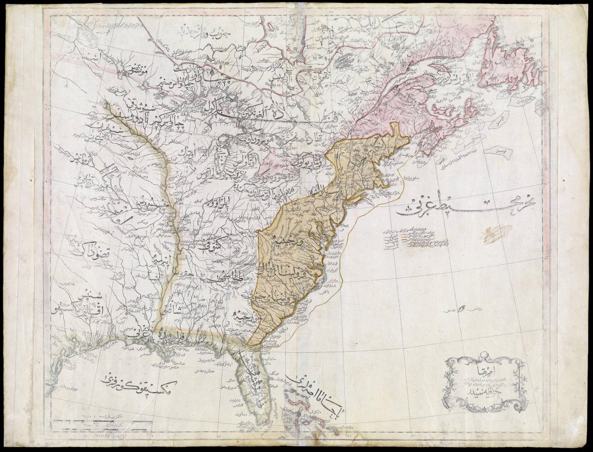
First Ottoman map of the United States): image via Amazing Maps @Amazing_Maps, 22 July 2015

World Map: Benedetto Bordone, 1528, woodcut, 325 x 165 mm (British Library, London)


Lion Map (Leo Belgicus): Claes Jansz Visscher the Younger, 1609, coloured etching and engraving, 470 x 572 mm (Stichting Atlas van Stolk, Rotterdam)

Lion Map (Leo Belgicus) (detail): Claes Jansz Visscher the Younger, 1609, coloured etching and engraving (Stichting Atlas van Stolk, Rotterdam)


![[synthetica.jpg]](https://blogger.googleusercontent.com/img/b/R29vZ2xl/AVvXsEirNO7NwlfE8qlbVcJiK6I_DdTugcbqN28DGIx-CUHof_PVIsXnNiw7buGVjTLomk6zp3_BMzd6rjjQo2hbdGHTUYrTkRy6xs9BBQ-33S2_54UwQx5geCsuIhHOvTk7VrYs92YlrFUafkEw/s1600/synthetica.jpg)
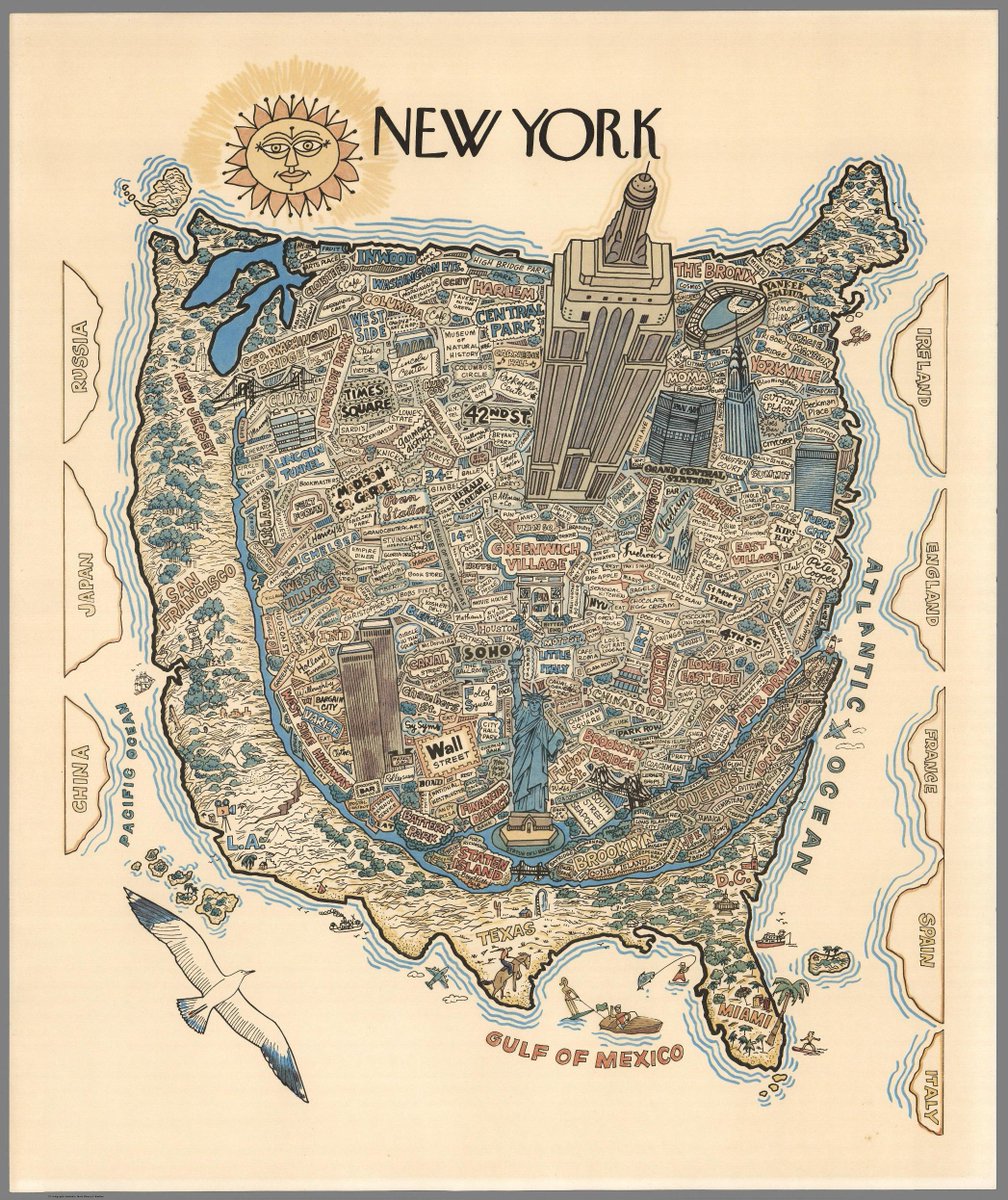
The world as New Yorkers see it: image via Amazing Maps @Amazing_Maps, 1 August 2015

New York: map of Flickr and Twitter locations. Red dots are locations of Flickr pictures. Blue dots are locations of Twitter tweets. White dots are locations that have been posted to both: image by Eric Fischer (See something or say something), 7 July 2011

New York: map of Flickr and Twitter locations. Red dots are locations of Flickr pictures. Blue dots are locations of Twitter tweets. White dots are locations that have been posted to both: image by Eric Fischer (See something or say something), 7 July 2011
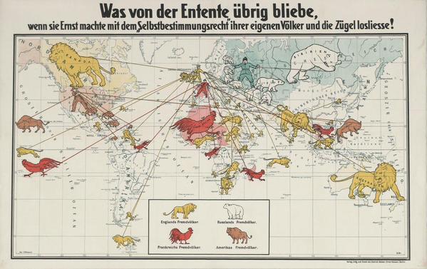
German propaganda map showing the Allies' colonial empires (c1916): image via Amazing Maps @Amazing_Maps, 24 July 2015
Accurata Utopia Tabula (Karte des Schlaraffenlandes): Matthäus Seutter (1678-1757), via Barry Lawrence Ruderman Antique Maps; image by Goustien, 19 February 2009
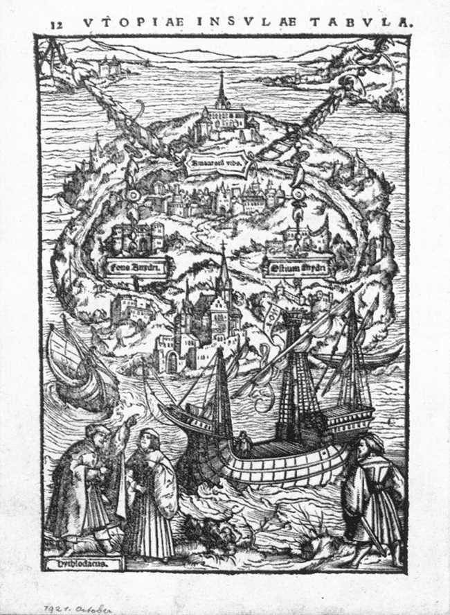
The Island of Utopia: Ambrosius Holbein, 1518, woodcut, 17.8 x 11.8 cm (Öffentliche Kunstsammlung, Basel)

Île Chairman: illustration by Léon Benett, in Deux Ans en vacances: Jules Verne, 1888
”RT @Mr_Bata: The South African map of Africa. @zapiro at his best! #Xenophobia: image via Rachael Akidi @rakidi, 20 April 2015

Some military instructions in Hebrew and a map of a school are seen on a blackboard after Israeli soldiers withdrew from the Beit Hanun High school for girls which was reportedly used as an advance base during Israel's military offensive against the Gaza Strip: photo by Marco Longari/AFP, 5 August 2014
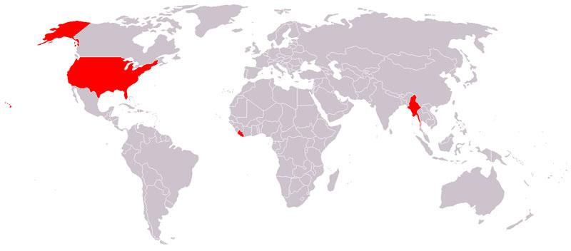
The only countries that don't use the metric system are Liberia, Myanmar, and the United States: image via Belal Dabour - Gaza @Belalmd12, 29 September 2014
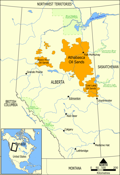
Map showing the extent of the oil sands in Alberta, Canada. The three oil sand deposits are known as the Athabasca Oil Sands, the Cold Lake Oil Sands, and the Peace River Oil Sands: image by Norman Einstein, 10 May 2006

Operational and proposed route of the Keystone Pipeline System (data source: TransCanada): image by Meclee, 21 July 2012
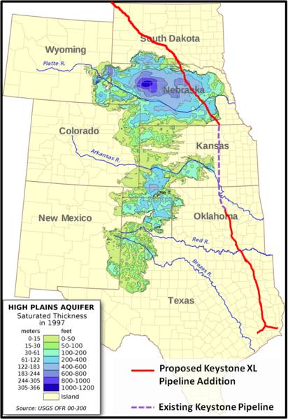
Saturated thickness map of Ogallala Aquifer with Keystone XL route layered: image by 570ajk, 17 November 2011, using aquifer map by kbh3rd

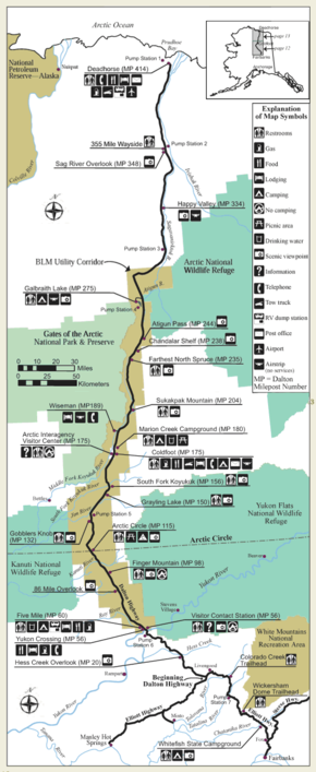
Trans-Alaska Pipeline map. A map of the route of the Trans-Alaska Pipeline, showing pump stations, cities, roads, mountain ranges and passes, and bodies of water.: image by JKBrooks85, 23 July 2009

Trans-Alaska Pipeline work camps map. A map of the route of the Trans-Alaska Pipeline, with pump stations and construction camps identified: image by JKBrooks85, 24 July 2009
Map of Dalton Highway (built as Trans-Alaska Pipeline North Slope haul road), Alaska: image by U.S. Bureau of Land Management, n.d.; image by Aconcagua, 8 July 2008

From
October 1999 through March 2012, 2,269 deaths were recorded at the
Arizona-Mexico border. Water stations, placed by the nonprofit Humane
Borders, are intended to mitigate the deaths.
Source:
Migrant death map provided courtesy of Humane Borders, Inc. Data
development by John F. Chamblee, Michael Malone, and Mathew Reynolds: image via Newsweek, 10 July 2013
Colours of passports around the world: image via Amazing Maps @Amazing_Maps, 4 August 2015
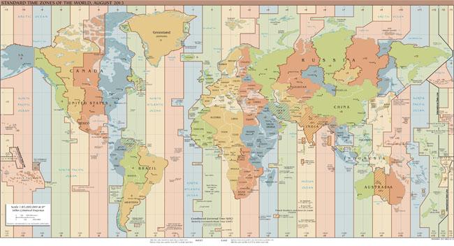
Standard time zones of the world: image via Amazing Maps @Amazing_Maps, 5 August 2016
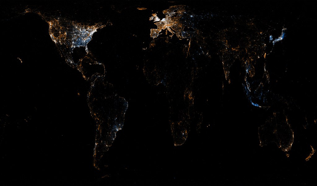
World map of Flickr and Twitter locations. Red dots are locations of Flickr pictures. Blue dots are locations of Twitter tweets. White dots are locations that have been posted to both: image by Eric Fischer (See something or say something), 7 July 2011
A map made entirely from Facebook connections : image via Amazing Maps @Amazing_Maps, 9 August 2015
Greater Tokyo area superimposed over Great Britain: image via Amazing Maps @Amazing_Maps, 14 August 2015
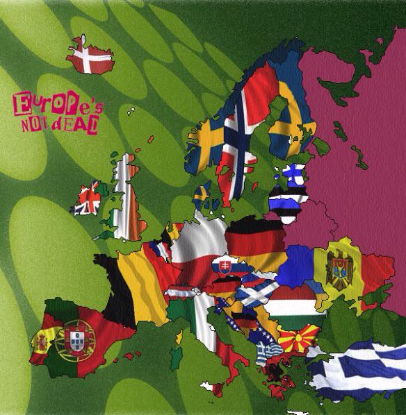
Map of which countries are the butt of the most jokes around Europe: image via Amazing Maps @Amazing_Maps, 7 August 2015
Average monthly disposable salary in USD: image via Amazing Maps @Amazing_Maps, 17 July 2015

European detail map of Flickr and Twitter locations. Red dots are locations of Flickr pictures. Blue dots are locations of Twitter tweets. White dots are locations that have been posted to both: image by Eric Fischer (See something or say something), 7 July 2011
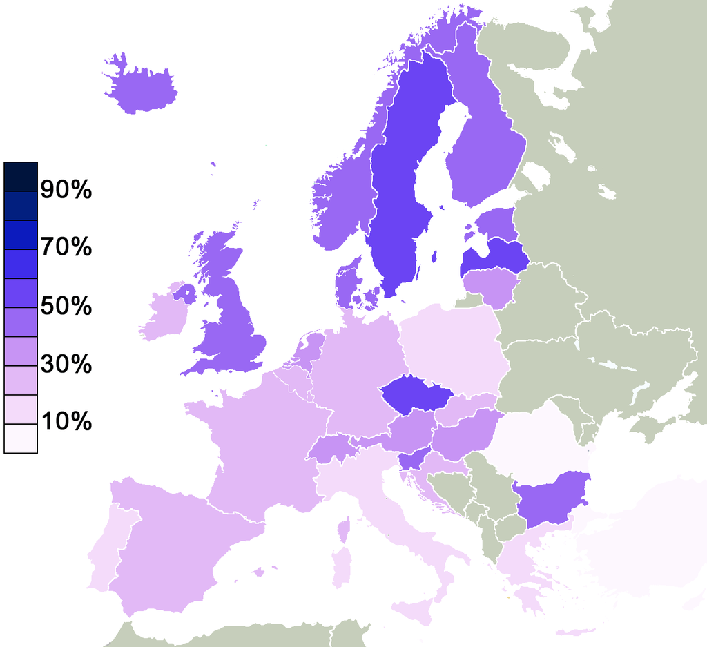
Percentage of non religious people in Europe that agreed to the statement "there is some sort of spirit life force": image via Amazing Maps @Amazing_Maps, 21 August 2015
Heavy metal bands per 100,000 people: image via Amazing Maps @Amazing_Maps, 8 October 2013
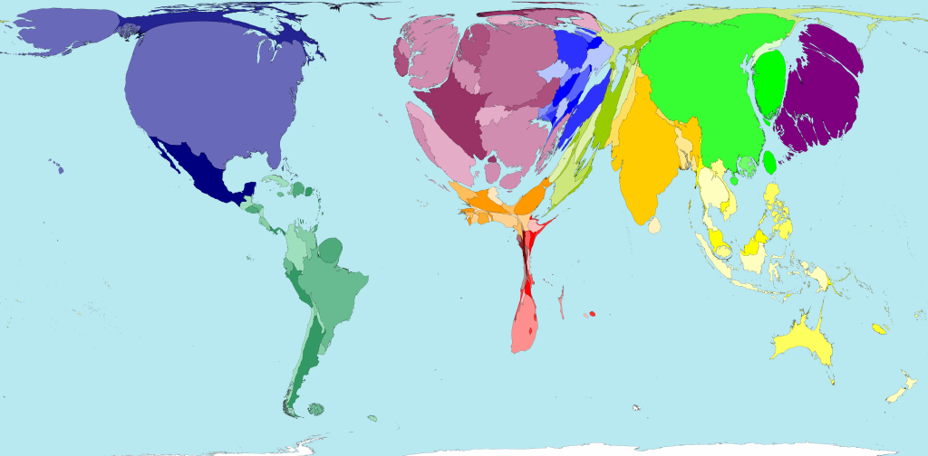
Where countries import the most from: image via Amazing Maps @Amazing_Maps, 7 August 2015
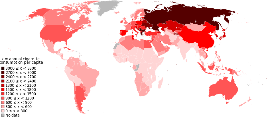
Cigarette consumption by country: image via Amazing Maps @Amazing_Maps, 30 July 2015
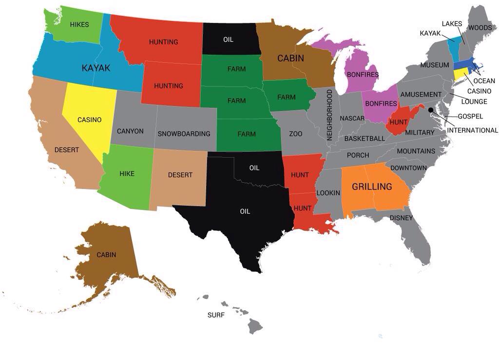
Most popular word used in online dating profiles by state: image via Amazing Maps @Amazing_Maps, 9 August 2015
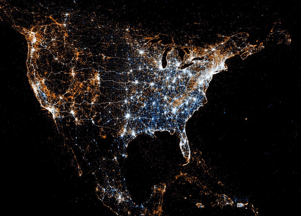
North American detail map of Flickr and Twitter locations. Red dots are locations of Flickr pictures. Blue dots are locations of Twitter tweets. White dots are locations that have been posted to both: image by Eric Fischer (See something or say something), 7 July 2011

North American detail map of Flickr and Twitter locations. Red dots are locations of Flickr pictures. Blue dots are locations of Twitter tweets. White dots are locations that have been posted to both: image by Eric Fischer (See something or say something), 7 July 2011
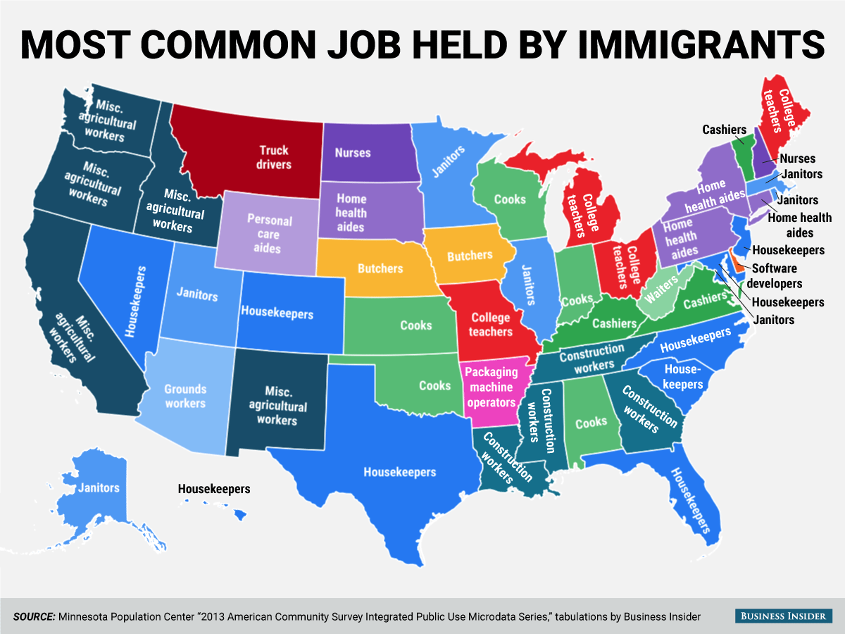
Most common job held by immigrants in the USA: image via Amazing Maps @Amazing_Maps, 18 August 2015










5 comments:
if we drew maps may be we would also lie without intention
Coming from a country that has seen its borders broken and shift, she's best placed to address the distance between the different surfaces.
An ostensively objective geological map turns treacherous all too soon in the hands of an oil executive. Sooner, depending on where the funding came from.
I guess if the Heavy Metal map had milled down to the Midlands we'd have been off the scale.
Tom,
What a beautiful poem this is. And what stupid organisms we are. Borders and boundaries have always shrunk what we think is our idea of space. Although we don't live in this world, that is not our world. Most of us are die here.
I found myself lost in the sucking vortex of online dating profiles, wondering whether the immigrant packaging operators of Arkansas ever consorted online with the immigrant software developers of Delaware with intent to attend off-world Heavy Metal concerts, but I fear there may be some statute covering that.
Tom,
Amazing maps indeed, my head is spinning -- must be all those Flicker and Twitter lights . . .
Post a Comment